Every successful crypto trader started by learning to read a chart. Whether you are watching Bitcoin test new highs or tracking an altcoin breakout, the ability to interpret price action is the single most important skill in trading. Charts tell you what the market is doing right now, what it has done before, and where it might go next.
This guide breaks down the core elements of crypto chart reading, from candlestick basics to volume analysis. By the end, you will know how to look at any chart and extract actionable information.
What Is a Crypto Chart?
A crypto chart is a visual record of an asset's price over time. The horizontal axis shows time (minutes, hours, days, weeks) and the vertical axis shows price. Most traders use candlestick charts because they pack the most information into each data point.
You can view crypto charts on exchanges like Bitunix and other major platforms, or through free tools like TradingView. The chart type you choose matters less than understanding what it shows you.
There are three main chart types:
- Line charts connect closing prices with a simple line. Clean but limited.
- Bar charts show open, high, low, and close for each period.
- Candlestick charts display the same data as bar charts but in a more readable format. This is what most traders use.
Understanding Candlesticks

Each candlestick represents one time period. On a daily chart, each candle equals one day. On a 4-hour chart, each candle equals four hours.
A single candlestick has four data points:
- Open: the price at the start of the period
- Close: the price at the end of the period
- High: the highest price reached during the period
- Low: the lowest price reached during the period
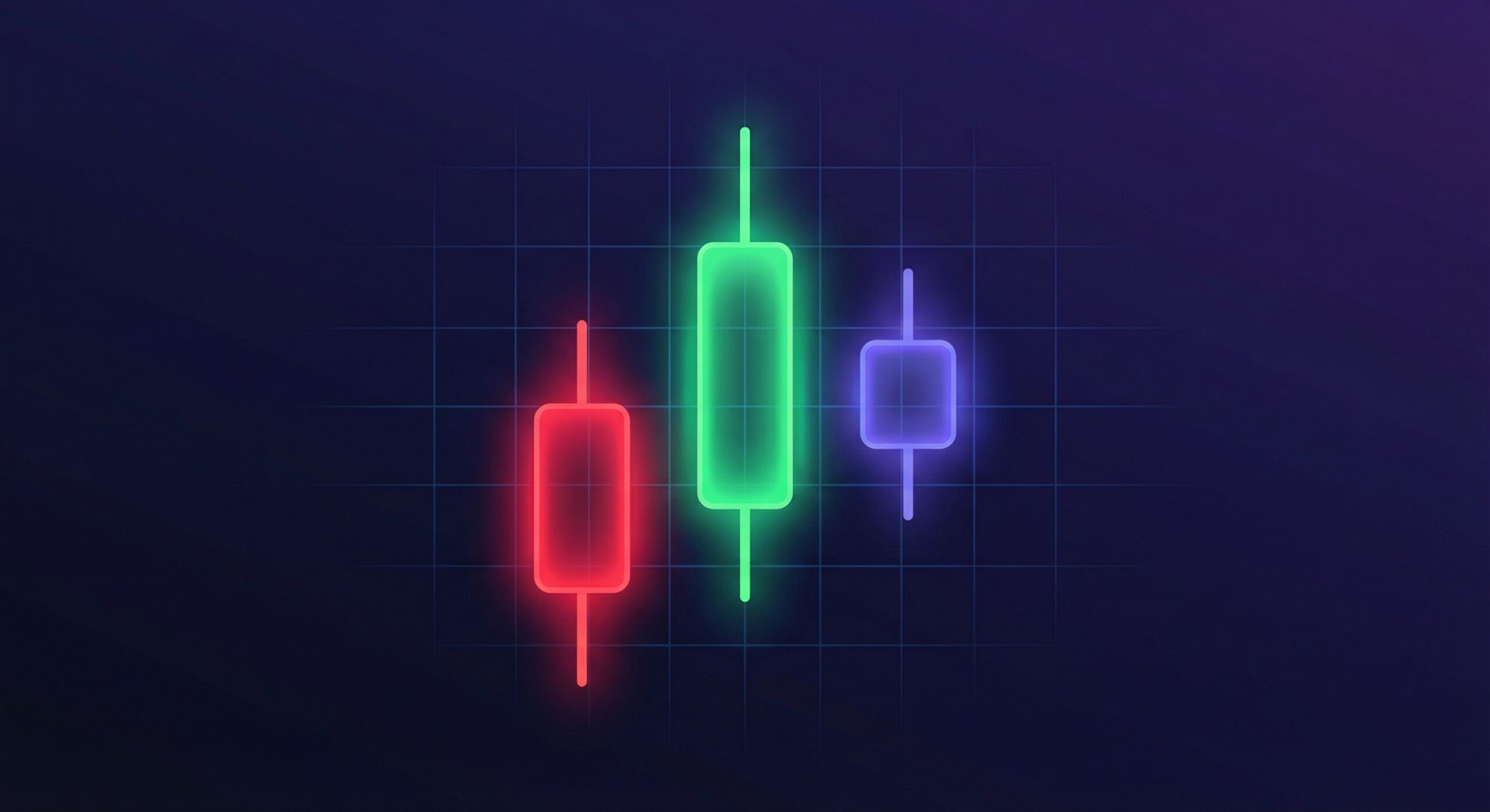
The thick part of the candle is called the body. It shows the range between open and close. The thin lines above and below are called wicks (or shadows), and they show the high and low.
If the close is higher than the open, the candle is bullish (usually green). If the close is lower than the open, it is bearish (usually red).
A Quick Example
Say Bitcoin opens a daily candle at $83,000. During the day, it drops to $81,200, rallies to $85,500, and closes at $84,800. That candle would be green (bullish) with a body from $83,000 to $84,800, a lower wick down to $81,200, and an upper wick to $85,500. The lower wick tells you buyers stepped in aggressively at $81,200.
Timeframes: Choosing Your View
The timeframe you select changes everything about how a chart looks. A 5-minute chart of Bitcoin might show wild swings, while the weekly chart of the same period could look calm and orderly.
Here is a general guide:
- 1-minute to 15-minute charts: used by scalpers and day traders
- 1-hour to 4-hour charts: popular with swing traders
- Daily and weekly charts: preferred by position traders and investors
A common mistake among beginners is trading off a single timeframe. Experienced traders typically check at least two. For example, you might use the daily chart to identify the overall trend, then drop to the 4-hour chart to find entries. This approach, sometimes called multi-timeframe analysis, helps filter out noise.
Support and Resistance: Where Price Reacts

Support and resistance are price levels where buying or selling pressure tends to concentrate. They are among the most important concepts in chart reading.
Support is a price level where buyers have historically stepped in, preventing the price from falling further. Think of it as a floor.
Resistance is a price level where sellers have historically taken profits, preventing the price from rising further. Think of it as a ceiling.
How to Identify These Levels
Look for prices where the chart has bounced multiple times. If Bitcoin has reversed upward at $80,000 on three separate occasions over the past month, that is a strong support level. If it has been rejected at $86,000 twice, that is resistance.
When support breaks, it often becomes resistance (and vice versa). After Bitcoin's recent drop below $82,000, the former support zone near $82,000 became a resistance level that bulls had to reclaim.
Round numbers ($50,000, $80,000, $100,000) also act as psychological support and resistance because many traders place orders at these levels.
Volume: Confirming the Move
Volume measures how many units of an asset were traded during a given period. It appears as a bar chart at the bottom of most crypto charts.
Volume tells you the conviction behind a price move:
- Rising price + rising volume = strong bullish move, likely to continue
- Rising price + falling volume = weak rally, potential reversal ahead
- Falling price + rising volume = strong selling pressure, bears in control
- Falling price + falling volume = selling interest is drying up, possible bounce
For example, if Ethereum breaks above $4,000 resistance with volume that is 3x the 20-day average, that breakout is far more reliable than one on below-average volume. Volume is the difference between a real breakout and a fakeout that could trap traders.
Three Beginner-Friendly Indicators
Indicators are mathematical calculations plotted on or below the chart. Hundreds exist, but beginners should start with just a few.
1. Moving Averages (MA)
A moving average smooths out price data to show the trend direction. The 50-day and 200-day simple moving averages (SMA) are the most widely watched. When the 50-day crosses above the 200-day, traders call it a "golden cross," a bullish signal. The opposite is a "death cross."
For a practical approach, watch how price interacts with the 20-period exponential moving average (EMA) on the 4-hour chart. In a strong uptrend, price tends to bounce off this line repeatedly.
2. Relative Strength Index (RSI)
RSI measures whether an asset is overbought or oversold on a scale of 0 to 100. Readings above 70 suggest overbought conditions. Readings below 30 suggest oversold conditions. During Bitcoin's January correction, RSI on the daily chart dipped to 28, signaling that selling was likely exhausted.
3. Volume Profile
This shows where the most trading activity occurred at different price levels. High-volume nodes act as magnets for price, while low-volume areas tend to be passed through quickly. If you want to understand where major positions are concentrated, volume profile is invaluable.
Putting It All Together: A Step-by-Step Process
Here is a simple routine for reading any crypto chart:
- Identify the trend. Is price making higher highs and higher lows (uptrend), lower highs and lower lows (downtrend), or moving sideways?
- Mark key levels. Draw horizontal lines at obvious support and resistance zones.
- Check volume. Is volume confirming the current move, or diverging from it?
- Add one or two indicators. A moving average for trend direction, RSI for momentum.
- Choose your timeframe. Start with the daily chart for context, then zoom into 4-hour or 1-hour for entries.
Do not stack ten indicators on the same chart. More indicators often means more confusion, not more clarity. The best traders keep their charts clean.
Practice Before You Risk Real Money
Reading charts is a skill that improves with repetition. Before you start trading with real capital, spend time analyzing charts without placing trades. Pick any coin, mark the support and resistance, note the trend, and write down what you think will happen next. Check back later and compare your prediction to reality.
Most exchanges offer demo accounts or paper trading modes. Take advantage of them. Once you are consistently reading charts correctly, you can start applying these skills to real trades with proper risk management.
[bitunix_cta]


